For 90 years, it has been Nutrilite’s honour to support you to achieve optimal health and helping people live healthier, better lives.
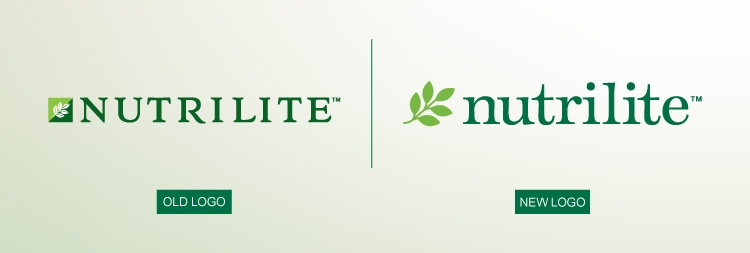
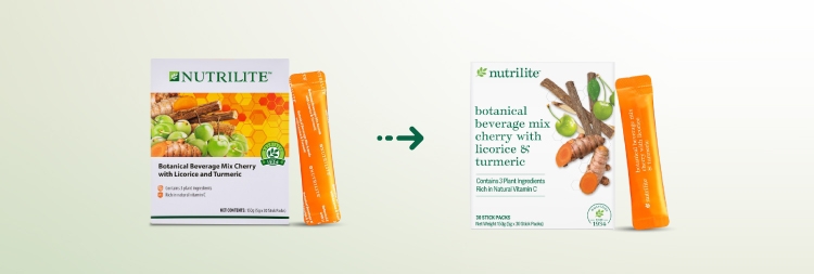
As Nutrilite continues evolving, we strive to provide pure, safe and effective products. As such, please be informed that the Nutrilite logo and product labels will be updated to evoke simplicity and a cleaner look, reflecting the health-forward and natural ingredients in our products.

Our refreshed green leaf design embodies a profound connection with nature and science, symbolising liberation and growth. Breaking free from constraints, it flourishes with vitality, echoing the potent essence of natural botanicals, with technological innovation, found within Nutrilite products.
In tandem with this revitalised emblem, we've adopted a lowercase font, evoking a sense of ease and approachability.
Now is the moment to welcome Nutrilite as your trusted health companion!

Our brand ethos revolves around harmonising the inherent qualities of nature with the precision of scientific innovation.
With a contemporary, natural and streamlined design approach, we're thrilled to unveil a refreshed aesthetic that not only captivates the eye but also embodies our commitment to authenticity and quality.
This revitalised look and feel will gradually cascade across our entire Nutrilite portfolio, ushering in a new era of excellence and distinction.
Please take note that this transition will take place in stages and products sold will be based on FIFO (First In First Out), i.e. products with existing labels will continue to sell until stocks deplete before products with new labels are made available. However, product images with new product labels on www.Amway.my will take some time to be fully reflected.
Newly launched products have already seen this transition, while existing products will undergo this restage, with the products’ formulation remaining the same.
For Nutrilite packaging updates, click here: web announcement